
I’M LION
Brand Design &
ARCHITECTURE
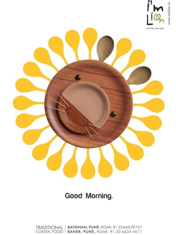
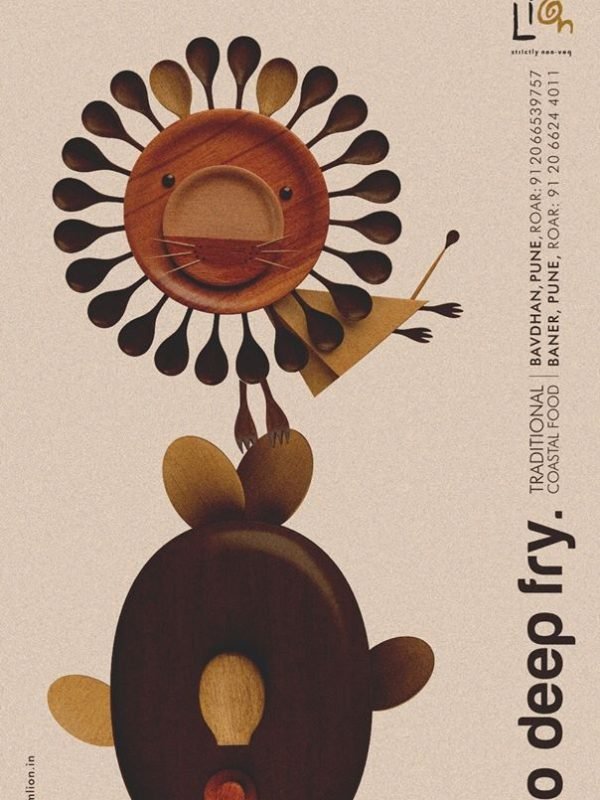
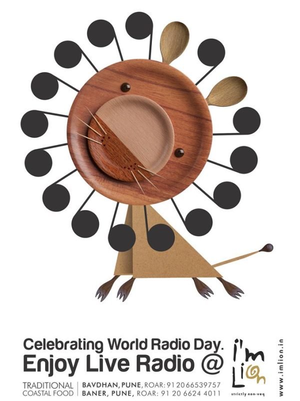
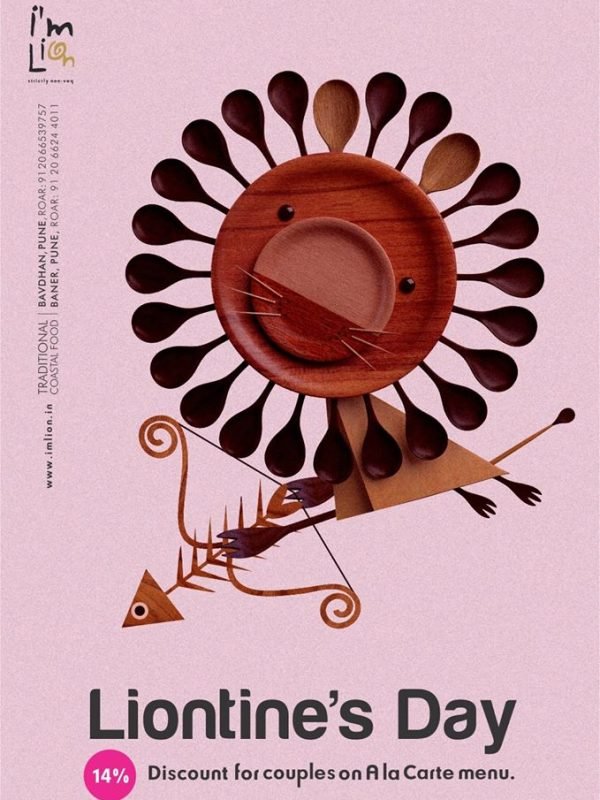
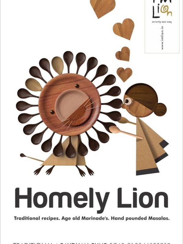
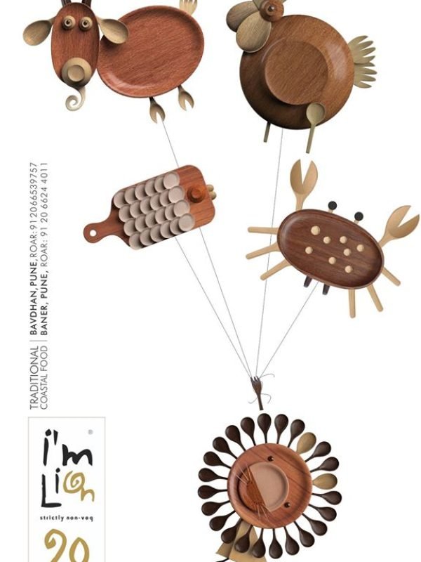
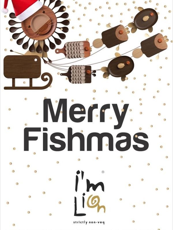
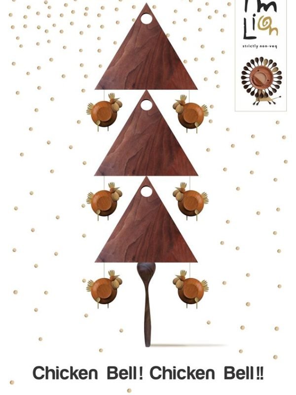
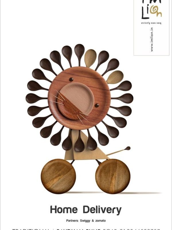
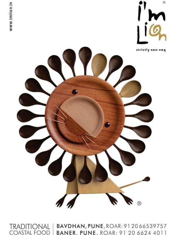
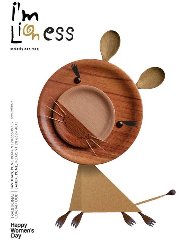
For I’M Lion, the story began with a name.A non-vegetarian & seafood cuisine specialty restaurant needed a name, so we called it I’M Lion. The lion first appeared in the typography itself, hidden within the logo. We then reimagined the lion using the restaurant’s own serveware, creating a distinctive visual asset that became the heart of the brand. From communication and menus to the interiors, the lion found its way everywhere – turning a restaurant into a memorable brand with a personality of its own.
Category
Restaurant + Cafe
Location
Pune
Brief
To create a distinctive name and brand identity for a new non-vegetarian restaurant.
Strategy
To break away from overused, clichéd names in the category and bring in a personal, memorable touch.
Idea
Every non-veg lover feels like a lion when indulging in their favourite dish. We turned this simple, relatable insight into the brand’s core idea.
Outcome
The name 'I Am Lion' is humorous, bold, and instantly sparks curiosity, driving frequent footfalls to the restaurant. he lion mascot - cleverly crafted from kitchen equipment -became a pathbreaking idea in the advertising industry.It went on to become one of Pune’s most iconic non-vegetarian restaurants, with even the interiors designed around the mascot’s concept.