Idea
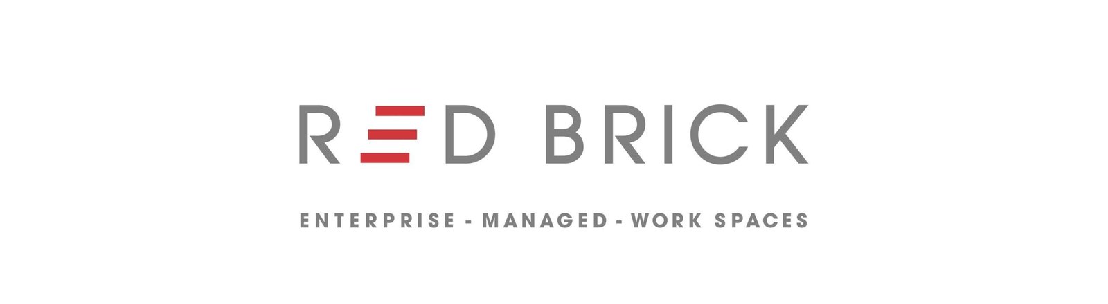
We introduced steps within the letter 'E' of the logo — symbolizing growth, progress, and upward momentum. This graphic element was extended as a flexible visual language across all brand communications and media.
Outcome
Today, Red Brick has overtaken many established giants to emerge as a leader in the premium managed workspace segment.